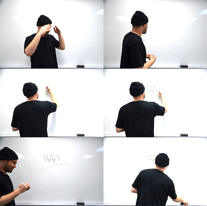
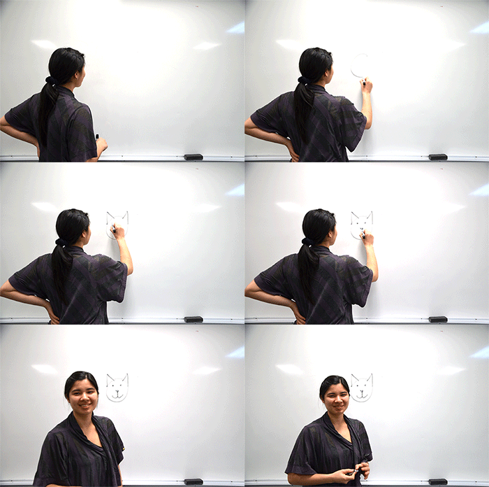
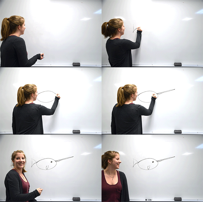
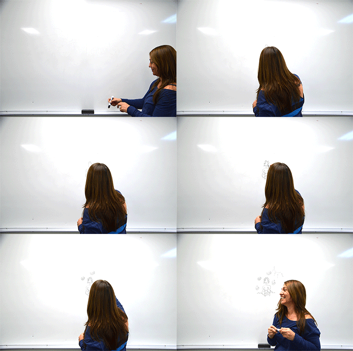
This is one good-looking edition of Pacific Rim Magazine, and credit largely goes to the hard work and talents of this year’s art department. Tight typesetting, modern layouts, an appealing colour palette, and art direction with a vision has been the M.O. of this group. Readers will, without doubt, be served up a heaping spoonful of style on May 8.
Name: Tom Bath
PRM Job Title: Associate Art Director
Best thing about working on PRM: Just getting the experience is huge. Any opportunity to become less of a n00b in this industry is crucial.
What would drive you crazier: A billboard that was poorly kerned, or a billboard with a series of images that were slightly out of alignment? The kerning for sure. When words become other words, problems occur.
If you were a Pantone Colour, what would you be and why? Restrictive questioning. How could I choose just one?
Explain your job on PRM in 10 words or less: I make sure Jayme and Jimmy don’t kill each other.
Name: Jayme Brown
PRM Job Title: Art Director
Best thing about working on PRM: The experience of working on a magazine! Working on a project that will actually go to print and out into the public is an amazing learning experience.
What would drive you crazier: A billboard that was poorly kerned, or a billboard with a series of images that were slightly out of alignment? Definitely a billboard with unaligned images. A simple thing like aligning images can make any design look better but for some crazy reason it doesn’t happen all the time.
If you were a Pantone Colour, what would you be and why? Teal (specifically Pantone 121-16 U), because my favourite colour always used to switch between green and blue, so eventually I settled for something in a middle. 
Explain your job on PRM in 10 words or less: I try to make things look nice.
Name: Olivia Dalton
PRM Job Title: Layout Artist
Best thing about working on PRM: Being able to collaborate with so much talent. I love seeing our original ideas come together in the layouts.
What would drive you crazier: A billboard that was poorly kerned, or a billboard with a series of images that were slightly out of alignment? I can’t stand when photos are out of alignment so a billboard with misaligned photos would grind my gears the most.
If you were a Pantone Colour, what would you be and why? I would be P 145-3 U. Mint green is always flossy and keeps it fresh.
Explain your job on PRM in 10 words or less: Creating layouts that visually compliment the story… then probably redesign it.
Name: Rae Fernandez
PRM Job Title: Layout Designer/Production Artist
Best thing about working on PRM: I always enjoy collaborating with like-minded, creative individuals. On top of all that, I get to design every day.
What would drive you crazier: A billboard that was poorly kerned, or a billboard with a series of images that were slightly out of alignment? Definitely a billboard that’s poorly kerned. Bad typography is unacceptable…Plus, I feel it’s more than possible to make pictures that are slightly out of alignment look good. Ha. Sometimes rules were made to be broken.
If you were a Pantone colour, what would you be and why? I’d say Pantone Black C or Pantone Cyan C. Black, to those who know me well, might seem like the obvious first choice, but Cyan is kinda cool too.
Explain your job on PRM in 10 words or less: I’m here to help make this magazine look as rad as possible.
Name: Emily Holtorf-Ma
PRM Job Title: Typography Specialist
Best thing about working on PRM: Being able to work with so many brilliantly creative people, and seeing what they’re able to come up with despite the constraints we’re working with.
What would drive you crazier: A billboard that was poorly kerned, or a billboard with a series of images that were slightly out of alignment? I don’t think I can decide. They’d both drive me pretty nuts. But I guess I have to say a billboard that was poorly kerned.
If you were a Pantone colour, what would you be and why? I would be Pantone 1118-5U because I really love that shade of blue. I actually did one of my first logos in a very similar colour.
Explain your job on PRM in 10 words or less: Invisibility. I do the stuff you aren’t supposed to notice.
Name: Vanessa Hunter
PRM Job Title: Photo Editor
Best thing about working on PRM: Working on PRM has really opened my eyes to the world of magazines. Deadlines are constantly creeping up and things get done really fast. But the craziness has led to some great bonding moments, and has really brought the group together.
What would drive you crazier: A billboard that was poorly kerned, or a billboard with a series of images that were slightly out of alignment? Probably the images. I’m a bit of an alignment freak. On another note, I’m creeping into the editorial side of things when I admit I saw a sign during Spring Break that was offering “Tennis Lessons for Spring Brake” posted at a tennis court. It drove me crazy every day it was up.
If you were a Pantone colour, what would you be and why? I can’t choose a colour that I would be because just one colour doesn’t describe me. Here’s my favourite colour instead. Pantone P143-16 U. This colour reminds me of being outdoors, which is where I’d rather be then trapped in the Mac Lab.
Explain your job on PRM in 10 words or less: Sourcing, shooting, receiving, and storing photos for the magazine.
Name: Marcella (Morgan MacDonald Reay) aka Cella
PRM Job Title: Layout and Production Artist
Best thing about working on PRM: I love being a part of this team. Every day I am inspired by the hard work, creativity and ideas that are sparked, shared and manifested.
What would drive you crazier: A billboard that was poorly kerned, or a billboard with a series of images that were slightly out of alignment? Looking at a billboard with images that were askew—I would find that irksome.
If you were a Pantone colour, what would you be and why? I would be Moon Rock 17-1210 because I think it is dead sexy (not in a dead way — in a very sexy way!). I can’t explain why I am slowly painting my house various shades of this browny–grey. It makes white trim pop and accessory colours like turquoise, hot pink, red, navy blue, metallics…sing Hallelujah.
Explain your job on PRM in 10 words or less: My job at PRM is to bring stories to life visually so the reader will say “oooohhh, what’s this?


